Earth Hour (WWF)

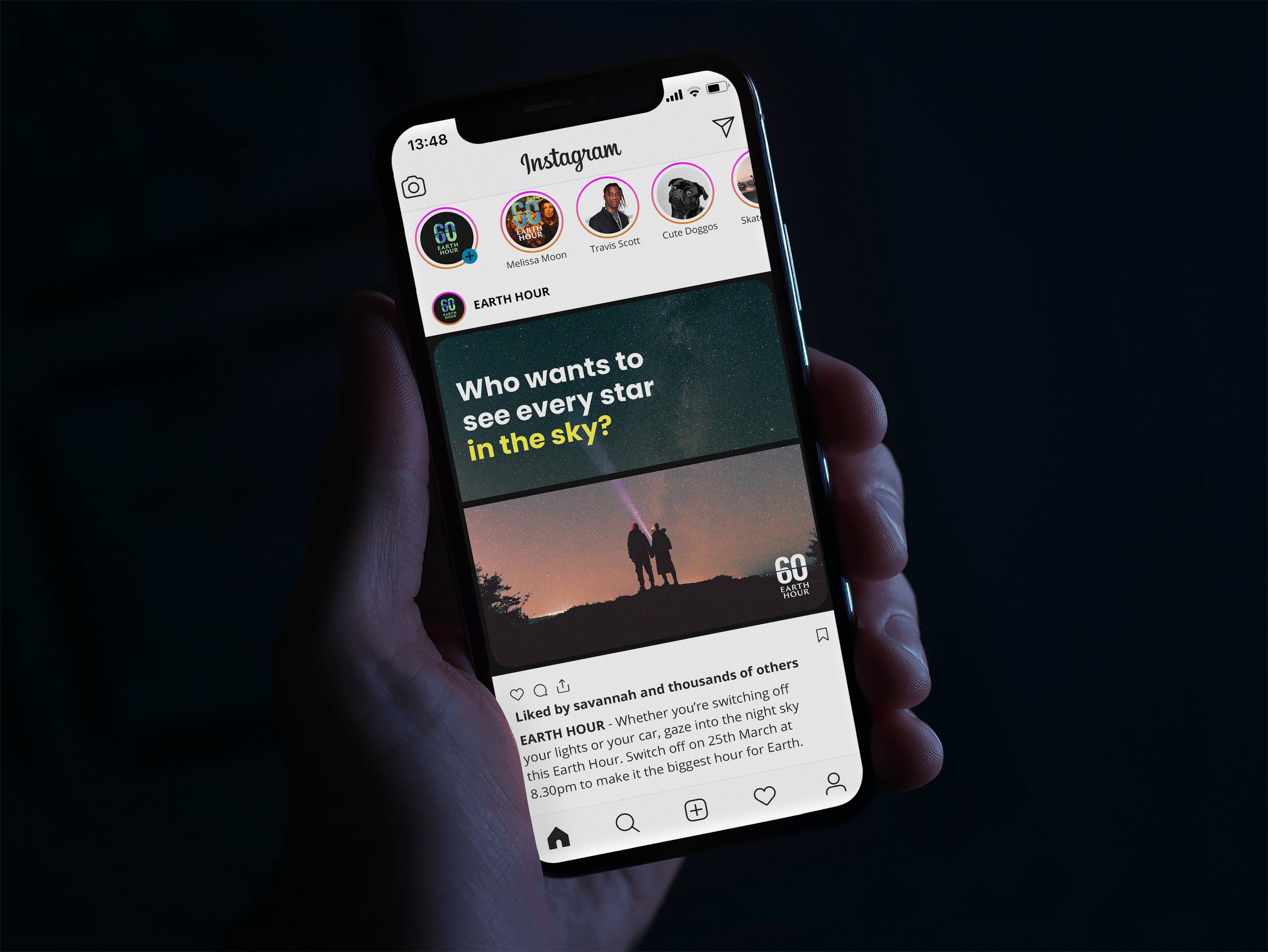
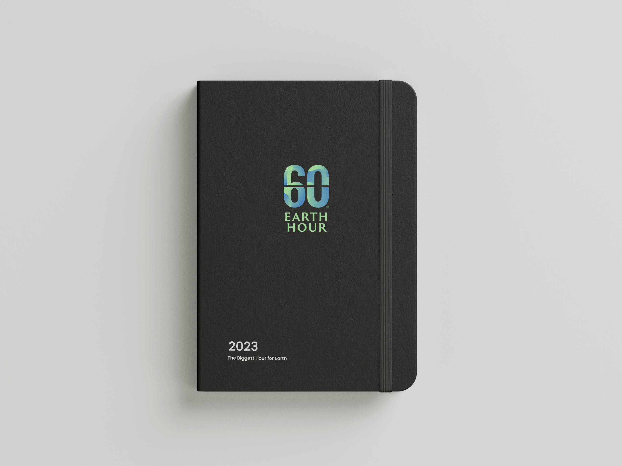
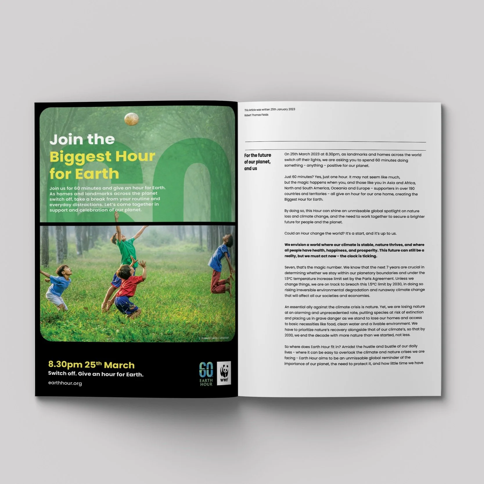
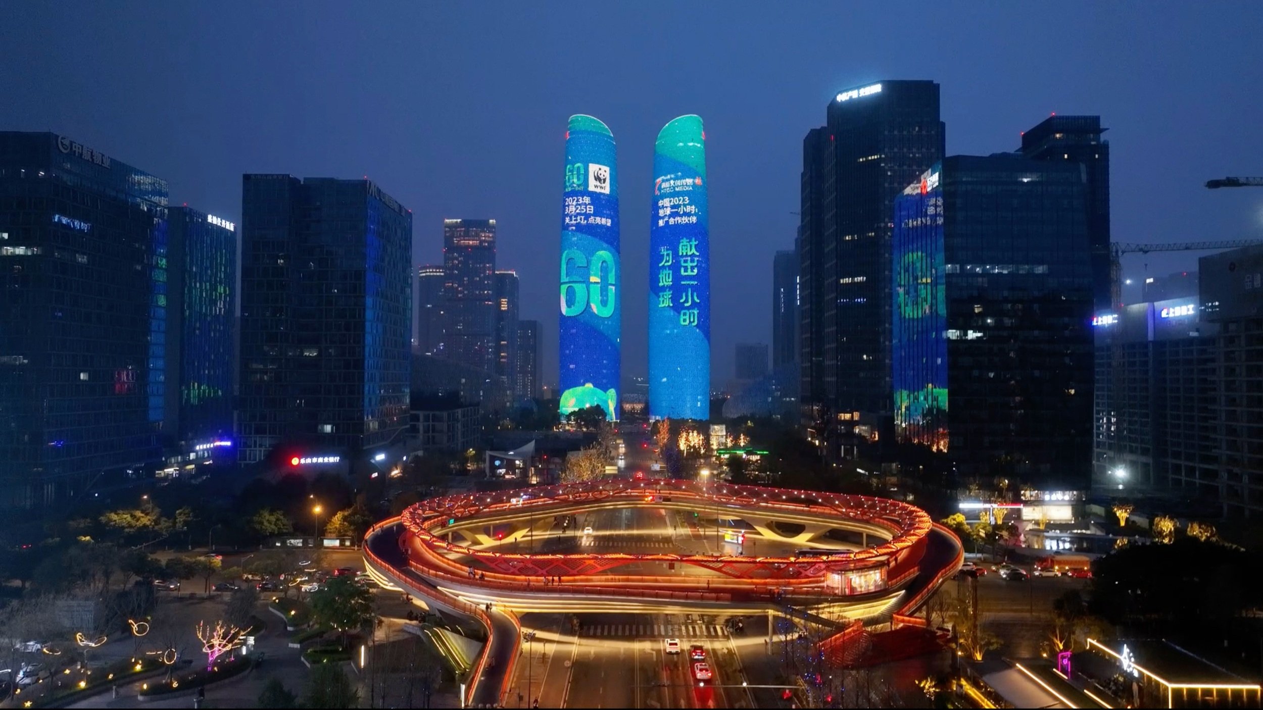
Since its inception, Earth Hour has cultivated a recognizable brand identity. Our goal was to preserve this essence while evolving it with a modern, refreshed look. We focused on introducing a new concept and designing a distinctive logo that would resonate with its mission and stand out in today’s visual landscape.
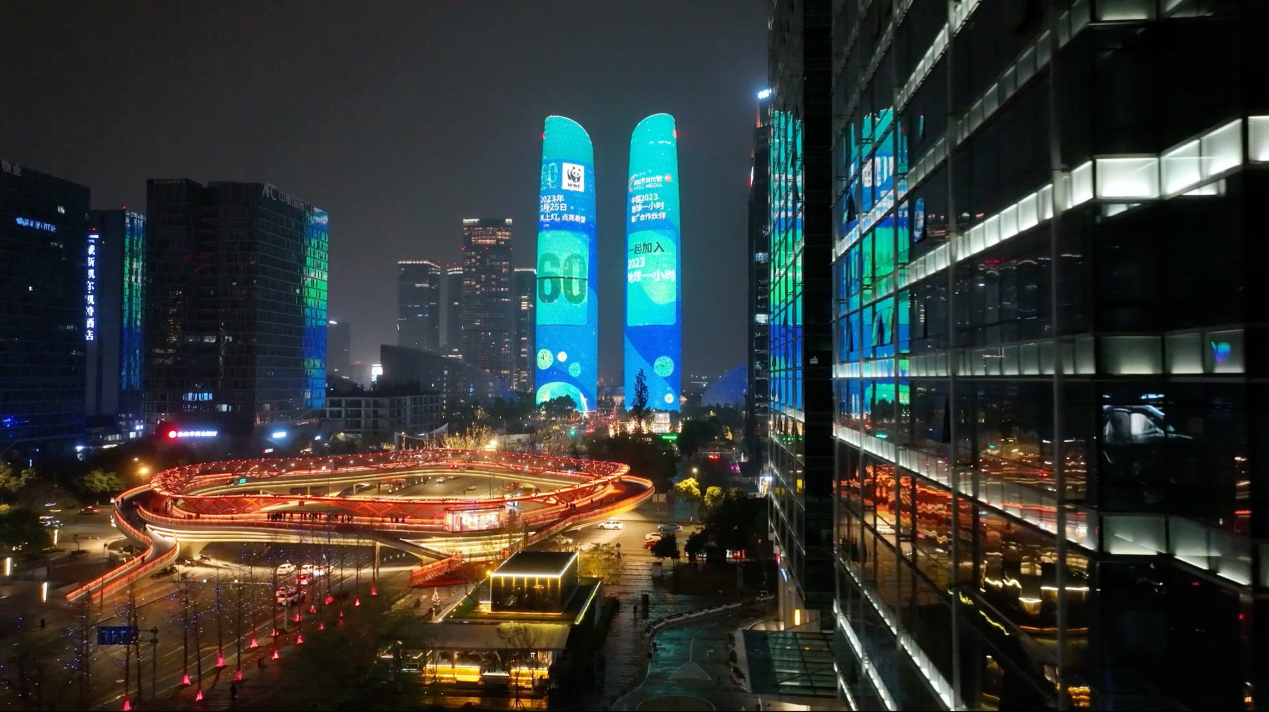
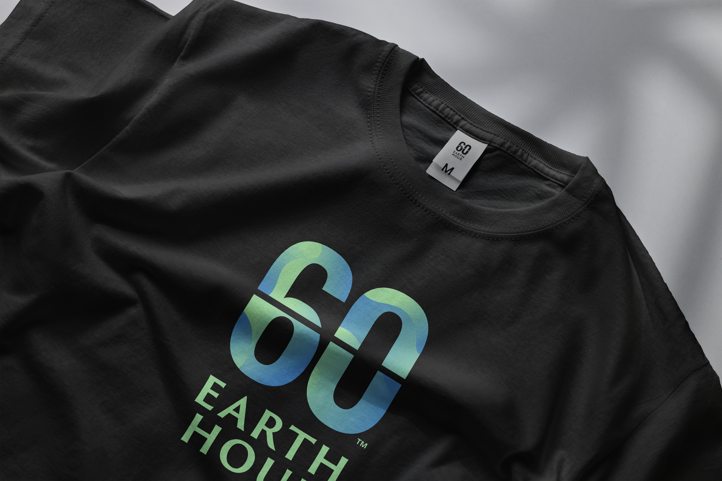
By introducing the flip clock motif, we aimed to connect the '60' with the concept of time, a core pillar of Earth Hour. It highlights how individuals can use their personal '60 minutes' to make a difference. Simplifying the colors and shapes within the logo further enhances its distinctiveness, ensuring it remains effective across both digital and analog formats.

Next
Next

Visit Qatar - AI Assistant